Preliminary Task: Double-Page Spread Analysis
Welcome come back everyone reading this post! In todays blog as promised, were diving right in to the process and execution of my double page spread. So without further ado, lets get right into it.
Image from: Canva
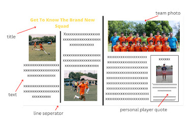
When thinking of what i wanted, i knew a lot of pictures across the two pages was a must for me. To me, it connects you, the reader, to what you are reading as you have visual impression of what the team and the players look like. This is why on top of adding just a team photo for the section of “Get to Know the Brand New Squad”, i decided to add a much wider variety of photographs of my teammates. For the first page, i created a standard format with a picture filling up half of its side of the page with the text making up the other half of their side. This creates a simple yet visually appealing way of reading the information. I decided a simple line to seperate the two sides of the first page was appropriate for the theme i had going on.
For the second page, i knew from the start the main point of the page had to be the team photo. After all, it’s what this section of the double-page spread is about. I wanted to make it the top half of the page so that it is seen as even more “superior” over all the other information. I then decided to shake up the information by adding a quote mini section. Using a small line border, i decided to add a picture of my teammate Noel and make it seem as he was offering a statement about something.
All in all, this has been such a fun journey creating my first double-page spread and all magazine elements in general. Well until next time folks, have an amazing rest of your day!


Comments
Post a Comment